You can choose any statistics displayed within your current experiment to feature on the panel, allowing you to customize it to fit your specific monitoring needs.
anyLogistix 3.3 is here, bringing powerful new features to help you analyze and optimize your supply chain more easily. This latest update focuses on improving how you interact with data, offering flexible tools for grouping and visualizing key metrics.
Whether you analyze performance or optimize processes, anyLogistix 3.3 simplifies complex data handling, empowering you to make informed decisions confidently. So, let's discover what’s new in the latest version.
Contents:
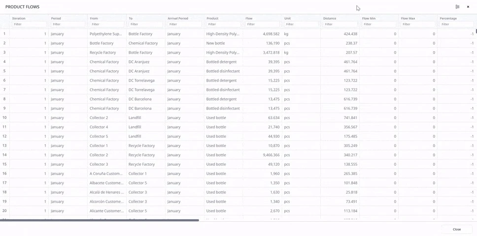
To streamline your experience analyzing experiment results, you can now group and aggregate data directly within anyLogistix.
Easily categorize values based on one or multiple text attributes, and the software will automatically organize the data into clear groups and subgroups for you. This feature simplifies the way you interact with and analyze data!
Moreover, you can further refine your data analysis by aggregating numerical values. Whether you deal with totals, averages, minimums, or maximums, each group and subgroup will display an aggregated value to give you precise insights right away.
Additionally, a Total row is now included at the bottom of your table to provide a comprehensive view of all aggregated data across the table.
These new capabilities allow you to:
Enjoy immediate access to detailed, specific object data and summary indicators without exporting tables for analysis. These improvements are designed to make your data evaluation experience more intuitive and efficient.

Output tables data grouping
Enhance your dashboard with a customizable metrics panel that displays multiple key performance indicators (KPIs) for your supply chain. This panel is accessible regardless of which dashboard page you are viewing, providing a consistent, always-visible reference to help you track performance efficiently.
You can choose any statistics displayed within your current experiment to feature on the panel, allowing you to customize it to fit your specific monitoring needs.
For a deeper analysis, you can compare the data on your metrics with corresponding statistics from other experiment results—whether from the current scenario or different ones.
You can rearrange the metrics panel or switch to an extended view to accommodate your dashboard layout. In the extended view, metrics are displayed in several lines, allowing you to fit more information neatly in line.

KPI metrics with the ability to compare with other runs
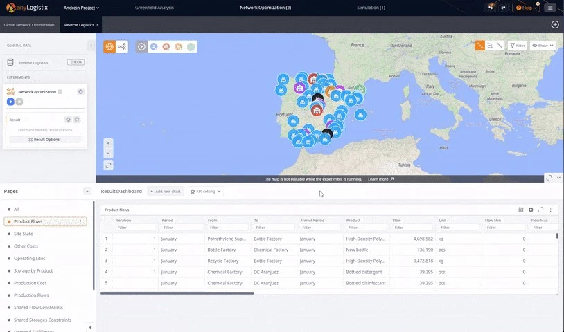
Transform how you view and analyze data in your analysis experiments. You are no longer limited to predefined table formats; now, you can select any specific value from these tables and display it independently on your dashboard. Combine multiple values into a single chart for a comprehensive visualization of your data.
This enhancement seamlessly integrates with the existing KPI functionality across both analytical and simulation experiments. You can enrich the KPI metrics panel by incorporating detailed statistics from various experiment types.
With the new version of anyLogistix, it’s up to you how to display statistics in your experiments.
Beyond traditional tables, you can present your analytical experiment result’s data graphically through line charts, bar graphs, histograms, or best-mean-worst visualizations. This feature empowers you to conduct and present your data analysis more effectively.
Tailor the graphical display to meet your specific needs by simultaneously detailing statistics according to facility, period, type of transport, or multiple criteria. You can arrange these detailed visualizations side by side for a comprehensive comparative analysis.

Custom data and graphical statistics display for experiments
We've updated our simulation model to allow loading and unloading gates to handle multiple vehicle types simultaneously. This improvement means that any of the specified vehicle types can now use the same gate for loading or unloading. The new feature makes operations more flexible and efficient.
In anyLogistix 3.3, you will find some more improvements to make your experience smoother and more intuitive. Here’s what’s new:
Download anyLogistix 3.3 today to take full advantage of these powerful new features. Streamline your data analysis and enhance decision-making processes without ever leaving the platform. Check out the release notes and get started now!